
INTERACTION DESIGN · ENTERPRISE · B2B · DESKTOP WEB
When the wrong person gets booked, everyone pays.
A manager needs people for a new build. She knows who's good. What she can't see, because nothing in her world tells her who's actually free. So She books the names she trusts, and some of them are already stretched thin across other work. Nobody catches it until the project starts slipping. By then the cost has spread to everyone: the person buried under too much, the deadline that moves, the teammates absorbing the overflow.
Whitecap is a resource planning platform that gives the team a shared, honest picture of team capacity, before commitments are made, not after.
Role
UX Designer
Timeline
2.5 Weeks
Project Type
Course Project

THE CLIENT
Nexora Technologies, a mid-sized AR software studio, which doesn't exist. I invented it on purpose. A fictional company let me control the org structure, the team, and the awkward edge cases instead of waiting for them to show up in real data. The problem it has, though, is one real companies live with constantly.
THE PROBLEM
At Nexora, resource planning lived in spreadsheets, Slack threads, and memory. Managers booked people who were already committed elsewhere. Others learned a teammate was overloaded mid-sprint, when there was little left to do about it. Nobody had a single, shared picture of who had capacity and who didn't.
THE GOAL
Make availability, skills, and workload visible to the people making staffing calls, before those calls turn into problems.
The name came from that idea. A whitecap is the moment a wave crests and you can finally see it. The whole product is about making hidden workload visible before it breaks the surface.
THE SCOPE
Design was scoped to the two people who own the staffing decision: the Project Manager and the Department Manager, and the core path that runs between them: scoping a project, staffing its roles, assigning the work, and rebalancing load when it tips. All of it on desktop, where this planning actually happens.
It was an MVP scope: solve the core decision first - who works on what, made with a shared and honest picture, for the two people who make it, then extend outward to the wider org and the use cases around it.
THE PROBLEM
Two managers sit on either side of every decision, and neither can see what the other one knows.
PROJECT MANAGER
Nisha
Nisha's job is to get a project built, which means finding the right people, with the right skills, who actually have the time.
She's good at the first two. The third is guesswork. Nothing tells her whether the engineer she wants is free or already buried, so she falls back on the names she knows and hopes it works out, because asking around takes longer than the deadline allows.
DEPARTMENT MANAGER
Arjun
Who owns the team Nisha is pulling from. His job is to keep his people from burning out and the projects from stalling.
But he's always a step behind. He doesn't see the overload coming; he gets told about it, mid-sprint, once someone's already past 100% and every option left is a bad one.
The blind spots feed each other
Here's what makes this a system problem, not a people problem: each one's blind spot is created by the other. Nisha books blind because nothing shows her what Arjun knows. Arjun reacts late because nothing shows him what Nisha just decided. Two reasonable people, both doing their jobs well, both missing the one piece of information the other one is holding.
RESEARCH & DISCOVERY
Before I designed a single screen, I mapped every move anyone could make in the system.
The research was already done before I arrived. The brief came with a set of insights and direct comments from the people who live this problem - project managers, engineering managers and summary of insights from team leads and direct contributors. My work began with reading it closely enough to find the single thing sitting underneath all of it.
The symptoms were everywhere, and they sounded different from every person:
"I only know my team's workload. I have no idea who else is free."
"I always go back to the same 2–3 people because I know what they can do."
"She said she was available, but turns out she was already leading another release."
one cause underneath them all: nobody could see the whole picture, so everyone planned from their own corner of it and leaned on the few names they trusted.
Each of them was being rational. The only information anyone had was what sat in their own head, so they worked from it and reused the people they could vouch for. Give them a fuller picture, and the behaviour changes on its own. The rest of the project is an attempt to give them that picture.
The CRUD scenario map
Building it was a different job from understanding it. Most UX projects reach for an information architecture early — a map of what goes where. That works when you already know what the system contains. Here I was starting blind, and organizing what you think exists is a reliable way to build something that looks complete and quietly isn't.
So I started somewhere else. Before drawing any of them, I mapped every move the system would ever have to handle.

The tool for it was a CRUD matrix - Create, Read, Update, Delete, the four things you can ever do to any piece of information. I ran every object through it projects, tasks, people, skills, allocations, approvals and it forced the questions that are easy to skip:
-
What can Nisha create, and what can she only read?
-
What can Arjun change, and what stays locked to him?
-
What happens when someone's skills are updated after they're already booked?
Choosing what to solve first
Underneath the scenarios sat the problems they were meant to solve 8 on the user side, 5 on the business side. The brief handed me the raw list; my job was to decide which ones the product would solve first. I scored each by how often it happened and how much it hurt, and that ranking set the build order.
The real challenge
That exercise produced more than forty distinct scenarios across both users before a single wireframe existed. The mapping surfaced the real challenge every screen would carry: judgment. The system had to weigh a person against a task and decide how well they fit, then show its work. Before I could design a screen that recommended someone, I had to define what "the right person" even means in numbers a machine can compute and a human can trust. That definition is where the design actually began.
STRATEGY & IDEATION
Two kinds of decision shaped this product - where to point it, and what its logic.
The strategy came down to a single bet: Whitecap would earn its place by making one thing trustworthy - the system's judgment about who fits what, and by delivering that judgment in stages, one solid layer at a time.
That meant depth over breadth. Five user groups have a stake in resource planning; two of them own the actual decision. I built for those two first, and for the handful of experiences that mattered most to them. A real MVP that went deep on the core call for the people who make it every day.
The guiding principle
A recommendation you can't explain is just a guess with confidence behind it. If Whitecap was going to tell Nisha "book this person," it owed her a reason she could open up, question, and overrule. That one requirement shaped every screen that followed.
My Process
My process was disciplined about a single thing: resolving the thinking completely before spending effort on form. The forty-plus scenarios from the mapping narrowed to three core ones. 2 belonging to the project manager, 1 to the department manager and those three are the flows the next section walks through. The workflows, the low-fidelity screens, the design language, and the high-fidelity work were all execution of thinking that had already been locked.
The decision that tested it
The honesty rule sounds clean until an edge case tests it. I tried to break my own logic before trusting it, and the first crack was in the score itself. The system suggested Priya for a role. Skill: perfect. Score: 80 out of 100, which any manager reads as "strong, book her." But Priya had 16 free hours against a job that needed 24. She couldn't do it. The math had let a strong skill score on paper, over an eight-hour shortfall, because it added the two together and a big number on one side covered a small one on the other. The recommendation was confident and wrong, at the exact moment Nisha needed it to be honest.


The fix was a hard rule: when a person lacks the hours, their skill never gets a vote. The score caps at "weak fit," full stop. Same Priya, same data, drops from 80 to 49 and now the number tells the truth. Skill never again disguises an availability problem.
That decision set the standard the rest of the product had to meet: a number that looks clean is never allowed to hide a problem underneath it. It is a small piece of math, and it is the spine of everything. Every screen in the next section exists to hold a high-stakes call to that standard.
THE SOLUTION
I walked the whole system through one real staffing decision, from empty project to assigned task.
Before the close-ups, here's the shape of the whole thing, what Whitecap is, and the path a piece of work takes through it, from an empty project to a task sitting on someone's plate.
The system has two sides that finally share one source of truth. Nisha works the project side: she builds a project and decides who does what. Arjun works the people side: he owns the team everyone is pulling from, and keeps it from tipping over. The same data feeds both, which is the entire point, because that shared picture is exactly what was missing before.
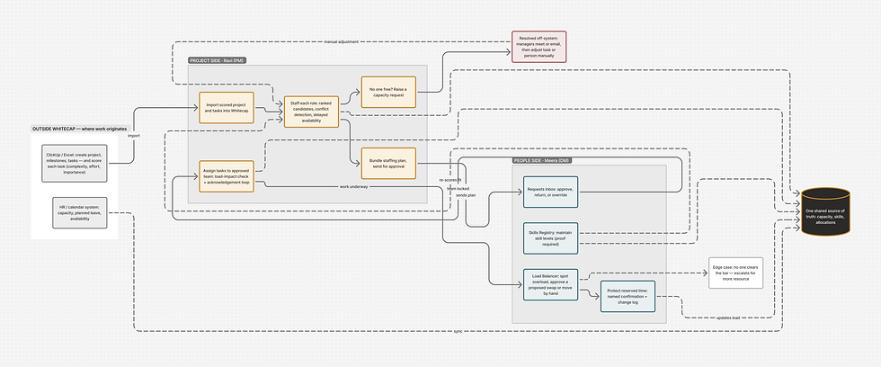
System Map
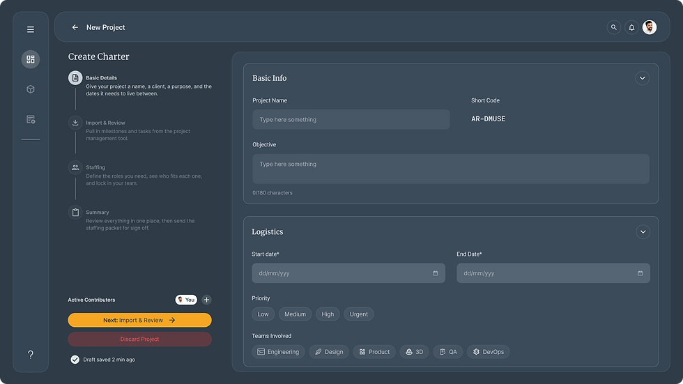
1. Create the project
Nisha sets up the project and lays out its milestones, the checkpoints the work has to hit.
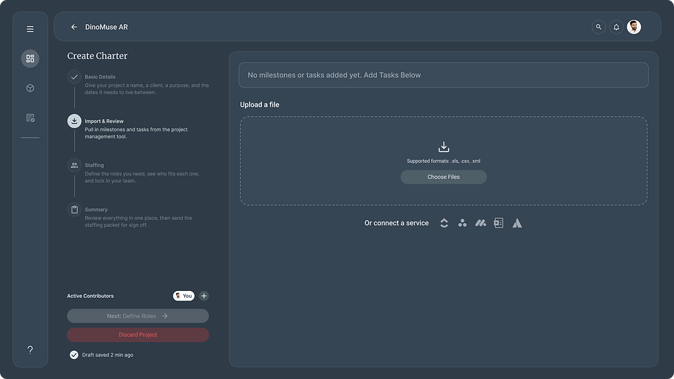
2. Break it into tasks
Each milestone becomes specific tasks. The system scores every task by how complex, heavy, and important it is.
3. Staff the roles
For each role the project needs, Nisha finds the right person, ranked by not her memory but the honest fit.
4. Get the team approved
She sends the whole staffing plan to Arjun in one go. He approves the team, and that approval is the line between "Nisha's idea" and "the real team."
5. Assign the tasks
With the team locked, Nisha hands out specific tasks and each person acknowledges before it's truly theirs.
6. Monitor and rebalance
From here on, Arjun watches the whole department's load across every project, and steps in when anyone crosses the line.
Steps one and two are the kind of thing every project tool does, so I'll keep them in the background. The decisions worth slowing down for live in steps three, five, and six. Let's follow those closely. Nisha has a project to staff.

Finding the right person
Nisha opens the staffing screen and sees the roles she needs to fill. For each one, the system has already done the work she used to do by asking around: it's looked at everyone who could do the job and ranked them by how well they actually fit.
%20Work-Breakdown%20Canvas.png)
DECISION 01
Rank by honest fit, and put the reasoning on the card.
Nisha doesn't just see a score; she sees what it's made of — the candidate's skill against the role, and the hours they have against the hours it needs. The recommendation argues its own case. She can agree or overrule it, but she's never asked to trust a number she can't see inside.
DECISION 02
Show what the booking does before she commits to it.
Each card shows two states: the person's week now, and their week if Nisha books them. Someone who looks "24 hours free" today might read "0 hours free, 100% loaded" the moment she confirms — and that's the number that actually matters. The card refuses to let her decide on the comfortable half of the picture.
DECISION 03
Don't bury a strong person just because they're busy this week.
Some candidates are perfect for the role but tied up for the next few days. The honest score caps them at "weak fit" — but the card also shows a second reading: "Strong fit, frees up Week 2," set apart with a dashed amber border.*
Why show both scores?
The overall score always reflects the worst case, because that's the honest one. The second score exists to add context, it turns a flat "no" into a real choice. Nisha can cover the first week another way, check whether week one even matters for this role, or pick someone clean across the whole stretch. A single number would have hidden two of those three options.
Turning the booking into real work
Nisha picks her person. Now the role has to become actual tasks. She moves to the work view, where the system suggests who should take each task, drawing only from the team already confirmed for this project, never the whole company.*
Why only the confirmed team?
Arjun approved this team once, at staffing. Re-opening the whole company at the task stage would quietly hand his approval back to chance and make him sign off twice for the same people. One approval, held where it was given.

DECISION 04
An assignment isn't done until the person says it is.
When Nisha assigns a task, the system shows the same honesty the staffing card did — before-and-after load bars, and a warning if the person tips past a safe threshold. But the real change is what comes next: the assignee can answer "Good to go," "Flag a concern," or leave it "Awaiting response." A flagged concern doesn't block Nisha — she can still confirm — but it's recorded next to the decision.*
Why let her confirm anyway?
The manager keeps the authority to make the call under a deadline. What she gives up is the ability to make it silently. The disagreement stays on the record, so a bad call is traceable to a real moment instead of lost.
Catching what slips through — the Load Balancer
Everything so far happens inside one project, in Nisha's view. But people work across projects, and no single project's screen can see the whole person. That's Arjun's screen — the Load Balancer.
This is the department manager's view: every engineer he owns, across every project, with their real workload stacked up. While Nisha sees her slice, Arjun sees the sum. When someone crosses 100%, this is where he catches it, and where he fixes it.

DECISION 05
Model time in three states, and protect what's been promised
Initialy tool split a person's time two ways: busy or free. That gap is where Nisha's booking could vanish. When Arjun approved her request to reserve someone for twenty hours a week, those hours were spoken for but until Nisha broke them into specific tasks, an earlier version of this screen would have shown them as "free," and another manager could have spent them without anyone knowing.
So the Load Balancer tracks three states:
-
Assigned - work tied to specific tasks.
-
Reserved - approved and promised, but not yet broken into tasks.
-
Buffer - genuinely open time.
Reserved time sits apart, off-limits by default.*
Why "by default" and not locked outright?
Sometimes a manager genuinely has to reach into reserved time — a real emergency, a higher priority. Blocking it completely just pushes the workaround off-system. So instead of a wall, there's a stop: the move names the person whose time it takes and the project it was promised to, and logs the whole thing.
DECISION 06
Let the system propose the fix, and make risky moves cost more than easy ones.
The first version of this screen let Arjun drag a task from an overloaded person to a free one. It failed in testing, dragging across a grid asked him to track two things at once, with no feedback until he'd already let go.
So I rebuilt the interaction around two ideas -
1.
The system does the hunting: it flags who's overloaded and proposes specific swaps for him to approve, instead of leaving him to find them.
2.
when he does move something by hand, the screen shows the result live, the target turns green or red and the new workload appears before he releases, not after.*

Why some moves are deliberately harder?
Not every reassignment costs the same. Handing a task to someone already on the project is cheap, and stays near one click. Pulling someone onto a project they've never touched is expensive in ways the hours don't show — unfamiliar code, lost context, slow ramp-up. For those, the screen makes him stop and write down why. The friction exists so the costly moves get made on purpose rather than by reflex.


DECISION 07
Let skills change, and let the score change with them.
People don't stay one level forever. An engineer finishes a certification, ships a harder project, crosses from Intermediate into Advanced. The moment that happens, the system's picture of them is out of date. So Arjun can open anyone's profile and raise a proficiency or add a skill as it's earned. The suitability score recalculates after edit. So he sees exactly what the change unlocks.
Why edits sit next to proof?
The score is only ever as honest as the skills feeding it. If a level could be raised just to win an assignment, the registry would quietly rot until the recommendations stopped meaning anything. So skill changes live alongside the certifications that back them, the evidence is what keeps the number worth trusting.

OUTCOMES
I want to be precise about what this project proves and what it can't yet.
It was never put in front of a real project manager or a real department manager. There are no adoption numbers, no time-saved metrics, no production data and inventing any would betray the one thing the whole product is about.
So I tested it the three ways a course project actually can: my faculty reviewed it, I audited it against my own original logic, and I ran the system as a simulation walking every flow as Nisha and as Arjun, treating the screens as the live product and watching for where the seams showed.
What held up?
The structure worked:
-
Logging in dropped each user into the right world.
-
Booking someone already committed elsewhere triggered a conflict instead of a silent double-booking.
-
Updating a person's skills immediately re-scored their fit and opened up work they couldn't touch a moment earlier.
-
The department view surfaced an overloaded person before anyone had to go looking.
What fell over?
The simulation, my faculty, and my own audit kept landing on the same kind of failure — the system could see a problem but wouldn't act on it:
-
A candidate with a hopeless score sat in the list looking just like a good one, leaving the manager to catch and ignore it alone.
-
The rebalancing screen could light an overload up in red but offered no idea who should absorb it.
-
Two managers were quietly doing the same staffing work on near-identical screens, with no line drawn between them.
-
The rebalancing interaction itself wasn't readable, my faculty flagged it.
None of these were cosmetic. Each one was the product being confident exactly where it should have been useful.
The Revision
That's where the second pass came from. Everything in the last two sections. The hard gate that stops a bad score from looking good, the three-state model that protects promised time, the rebalancer that proposes a fix instead of just naming the problem, exists because this testing went looking for the breaks first. The design got better because I treated my own work as something to test against rather than defend.
What I can't prove yet?
The brief had also set the bar this was meant to clear "cut double-bookings by 80%", "push planning visibility three or more weeks out", make "50% available" mean the same thing to everyone. Those targets are what every decision was quietly measured against. I can't report on any of them, because the part only real users can settle hasn't happened yet.
A simulation can prove the logic is coherent and the flows connect end to end. It can't prove that a real manager, mid-deadline, reads the honest score and trusts it instead of reaching for the name they already know. That's the test this design hasn't had and naming the targets it was built to hit is the most honest way I can point at it.
REFLECTION
This project changed how I think about my own finished work.
The thing this project taught me is the gap between a design that looks finished and one that's actually honest — and how easily I mistook the first for the second.
My first version was complete. Every screen connected, every flow resolved, the logic looked airtight. It took deliberately trying to break it to see that "complete" and "trustworthy" aren't the same thing. A score can be fully designed and still lie. A screen can handle every state and still strand the user at the one that matters. I already knew how to make a system look whole — what I learned here was to stop trusting that look, especially in my own work.
What I'd do differently
The fix I'm proudest of is the reserved-time model - protecting hours that have been promised so no one can quietly spend them. But I built that reservation as one fixed block locked for an entire project phase. Real teams don't work that way. People's time tightens and loosens week to week, and the reservation should flex with it. Shrinking as actual tasks get assigned against it. I saw that gap. I didn't fix it. That's the first thing I'd reopen the file to do.
The rest, only real users can teach me. But the instinct I'd keep is the one this project sharpened: design a system to tell the truth about itself, then go looking for the place where it doesn't.