
UX DESIGN · INFORMATION ARCHITECTURE · EDUCATION · DESKTOP WEB
When the structure is the problem, redesigning the surface changes nothing.
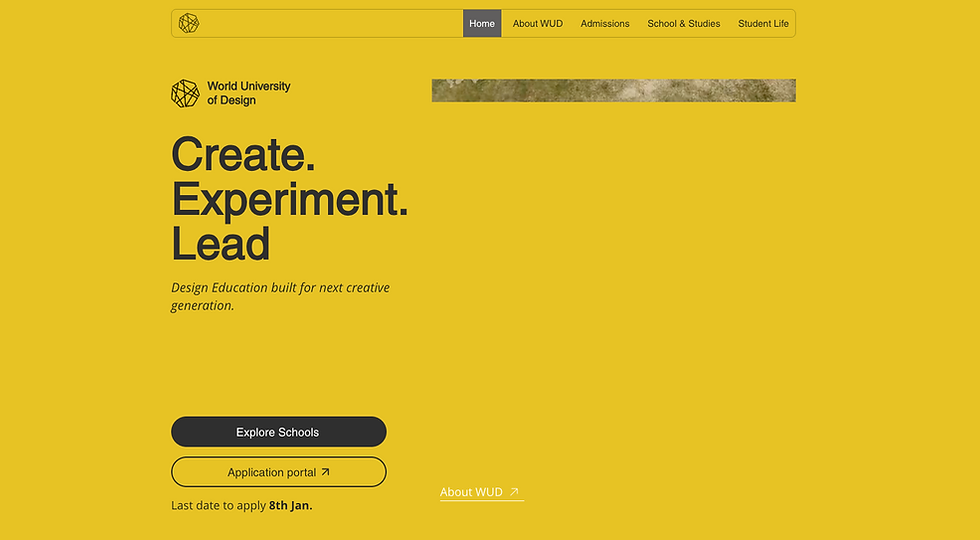
WUD's website had 15,000 monthly visitors and a 49% bounce rate. Students were arriving and leaving in 37 seconds, not because the site looked wrong, but because it was built around how the institution thought about itself, not how a student makes a decision about their future.
Role
UX Designer
Timeline
5 Weeks
(Feb–Mar 2026)
Project Type
Live Client
THE CLIENT
World University of Design, A multidisciplinary institution offering programs across architecture, fashion, communication, product design, and more. Its campus, studio culture, and student output reflect genuine creative excellence. Its website did not.
THE PROBLEM
Students arrived, found nothing that met them where they were, and left. The site was structured around institutional hierarchy — departments, administrative categories, faculty listings. It had no answer for the question every prospective student arrives with: What can I become here?
THE GOAL
Rebuild the website around the student decision journey — from career curiosity to confident application — without losing the institutional structure the client needed to maintain.
THE SCOPE
Screen design was scoped to four pages where the student decision actually happens: Homepage, School, Program, and Career Insights. The IA and content strategy restructure covered the full sitemap.
Student Life pages were identified as relevant to the journey but deferred to the next phase, this was an MVP scope: solve discovery-to-decision first, then extend into experience validation.
AVERAGE SESSION DURATION
WUD
37 sec
PEERS
1-5 mins
BOUNCE RATE
WUD
49%
PEERS
18-31%
MONTHLY VISITS
WUD
15k
PEERS
45k -105k
Leadership read this as a traffic problem. The data said otherwise. SimilarWeb benchmarking against its competitors confirmed: WUD had an engagement problem, not a traffic problem.
Where WUD was losing students and which competitors were winning them.
Before any structural decision, I mapped the full student decision journey across six stages: Career Curiosity, Career Exploration, College Discovery, College Evaluation, Application Intent, and Application Action. For each stage I documented what the student was doing, what WUD was currently doing, and what competitors were doing better. The gaps in red told the story.
Three findings that drove the most significant design decisions:
01
WUD entered the student's journey too late.
At the Career Curiosity stage, when a student is exploring interests through YouTube, social media, and Google. WUD had no presence. Pearl Academy won this stage through career-led content and strong digital visibility. WUD's site assumed students already knew they wanted to study design. Most didn't yet. The Career Insights page was a direct response to this gap.
02
The linkage between interests, careers, and programs was absent.
At the Career Exploration stage, students need to understand what specific careers involve before they can evaluate a program. WUD had program descriptions but no career-to-program mapping. IIAD won this stage by explaining careers and outcomes before pushing academic content. The Guidance Questionnaire addressed this for students who couldn't yet name their career interest. The career exploration section on the homepage addressed it for everyone else.
03
WUD's value proposition didn't survive a quick scan.
At the College Discovery stage, when students rapidly scan multiple university sites, WUD's homepage failed to communicate what made it distinctive within seconds. Srishti won this stage through visual storytelling and student work. The homepage redesign prioritised immediate clarity: design philosophy in the hero, pedagogy in the second section, student work before any application ask.
The customer journey map identified which competitor was winning at each specific stage and why. Every structural decision traces back to a named gap at a named stage.
Two personas. One family. Completely different needs from the same website.
THE STUDENT
Arav, 18
Exploratory, mobile-first, no mapped career direction yet. Arrives curious. Needs the site to meet him at that starting point, not push him toward an application he isn't ready for.
THE PARENT
Rajesh, 47
The family's final decision-maker. Needs institutional credibility, visible outcomes, and fee clarity. Won't engage with a site that makes him hunt.
Built from stakeholder conversations with WUD's admissions team and secondary research into Indian design education decision patterns. Key constraint: 80% of Aarav's cohort browses mobile-first, but the project scope was desktop-only. Called out explicitly as a scoped constraint.
DIAGNOSIS
Six structural failures. Not one page problem, a system problem.
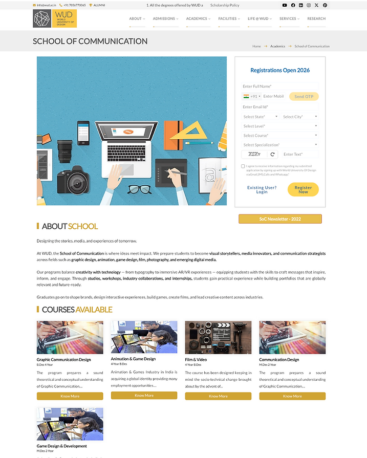
Before touching any design tool, I audited the existing site against the user journey. The problems didn't live on individual pages. They appeared as a pattern across the entire structure:


01
No Guided Journey
Students struggle to move from exploration to application because the website presents information as isolated pages rather than a staged decision journey.
03
Admissions Information Is Fragmented
Critical application details, policies, and support resources are distributed across multiple sections, creating uncertainty at the decision stage.
05
Engagement Without Conversion
Analytics show visitors arrive and explore briefly but rarely progress deeper into the admissions funnel.
02
Program Discovery is Misaligned
Academic information is structured around institutional organization instead of how students think about careers and degrees.
04
Trust Signals Are Scattered
Important indicators such as outcomes, industry connections, and credibility cues are not placed where parents and students expect them.
06
A Repository, Not a Platform
Instead of guiding decisions, the site primarily acts as an information archive.
Every decision mapped to a problem. Every problem mapped to an outcome.
01
Structure should follow the student's mental model, not the institution's org chart.
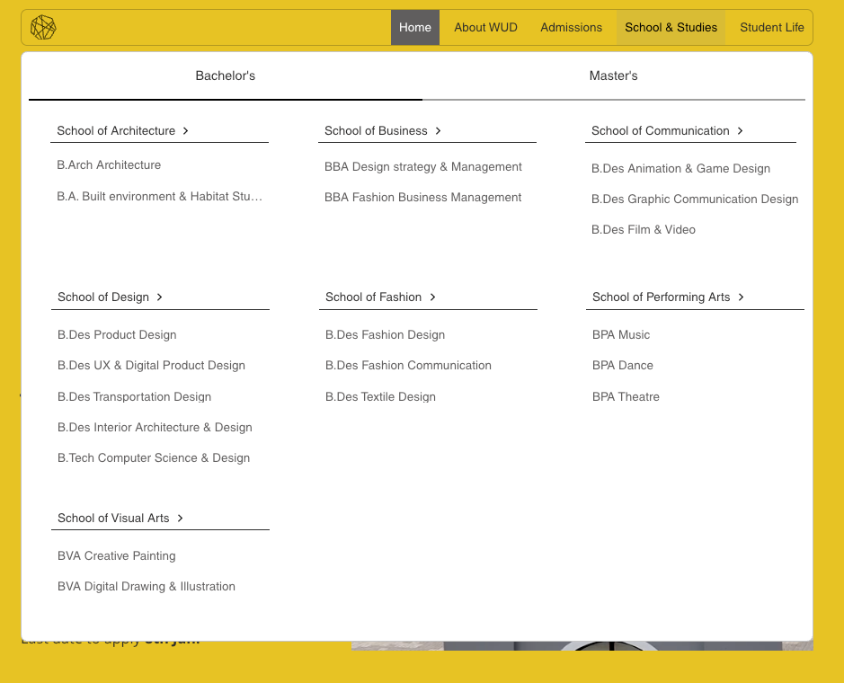
Programs nested inside their schools. Admissions stripped to three degree-level items. Navigation renamed from administrative vocabulary to student vocabulary. The site stopped being organised around how WUD thought about itself and started being organised around how a student navigates a decision.

02
Earn the action before asking for it.
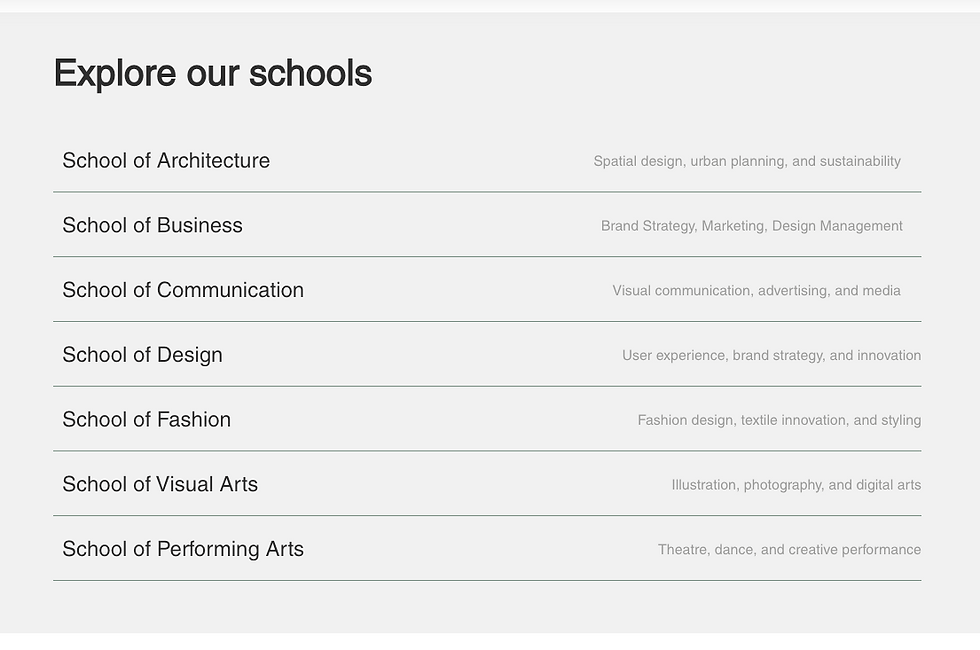
Every page opened with a registration form. The redesign removed conversion pressure from every discovery-stage page and moved every CTA to the point where content had earned it. The ask comes last — not as a UI preference, but as a statement about what a visitor deserves before being asked to commit.


03
Trust signals work at the moment of doubt, not before the conversation starts.
Accreditations above the fold read as defensive. Alumni outcomes on program pages, industry collaborations on school pages, governance under About WUD — each trust signal now appears where the user who needs it is most likely to be, not front-loaded before any content has given them a reason to care.


04
Career content is the entry point, not a footnote.
Students at the Awareness and Exploration stages need to understand what they could become before they can evaluate whether a program is right for them. Career information moved from paragraph three of program pages to the third section of the homepage, the top of school pages, and two entirely new pages built specifically for students who think in careers before disciplines.


05
Exploration and commitment are different journeys — the site should treat them that way.
The old site mixed program discovery content with application process content inside the same Admissions section. Separating them — exploration in School & Studies, commitment in Admissions — means a student browsing programs never accidentally enters an application funnel they're not ready for.

Two pages that didn't exist because a gap in the sitemap is a gap in the student's journey.
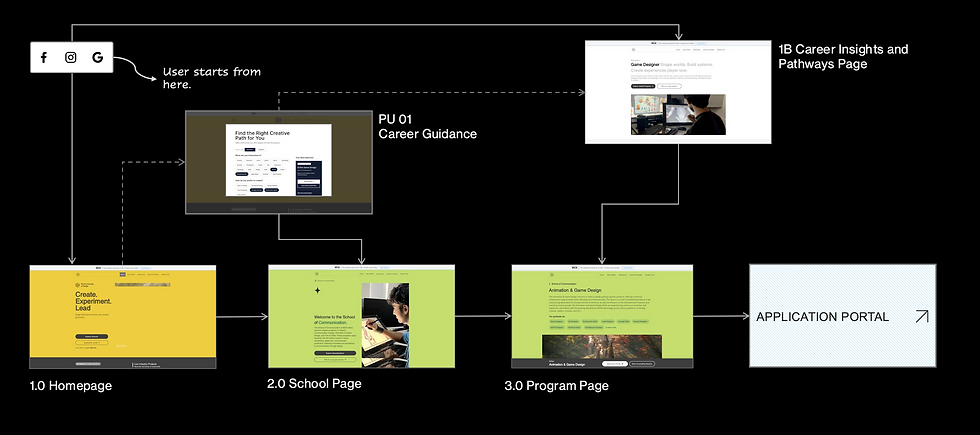
Aarav doesn't arrive knowing which discipline he wants. The old site had no entry point for a student who thinks in careers before disciplines.

01
Career Insights & Pathways
This page answers "What does a Game Designer actually do?" before asking students to choose a program. Role scope, required skills, industry context, then a connection to relevant WUD programs. My proposal — not in the original brief.

02
OVERLAY PAGE
Guidance Questionnaire
This page is for students who don't yet have a career direction. Interest → working style → environment → program match, with percentage scores. Serves a distinct cognitive state that the Career Insights page couldn't.
Alternatives
I considered solving both problems within the existing page structure. Career tags on program cards, an embedded homepage selector. Both assumed context Aarav didn't have. A student who doesn't know what a UX Designer does can't use a career tag to make a decision.
Three structural approaches to the student journey.
Variation 01 — Career-first
Mirrored the student's cognitive path exactly. Failed in practice: WUD didn't have career content at scale to support it. A flow that enters through career curiosity needs rich career pages to land on.
Variation 03 — Institution Aligned
The client preferred this. Simple, no new content required. The specific failure: no entry point for an undecided student. A 49% bounce rate is the behaviour of someone who didn't find a foothold, not someone who found what they needed and left satisfied.
Variation 05 — Hybrid Approach
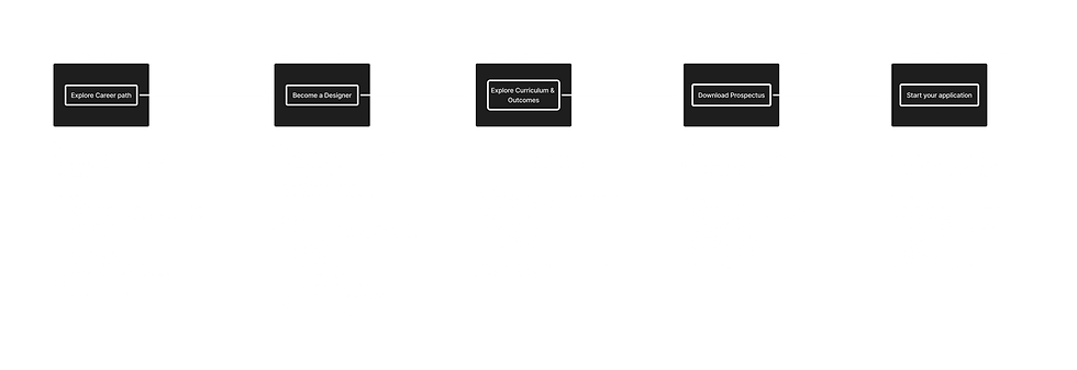
Main path follows the institutional hierarchy the client needed. Two new entry points branch off for undecided students. Career Insights and the Questionnaire, and feed back into the same funnel at School or Program level. The client's structure preserved. The missing student served.

The content largely existed. What changed was where it lives.
Old sequence: form → institutional description → academic content → proof
New sequence: philosophy → career context → academic content → proof → conversion
Homepage
Registration form removed from above the fold. Schools changed from undifferentiated image tiles to a text hierarchy with one-line descriptors. Career exploration added as a homepage section for the first time.
A university homepage has one job: give a curious stranger a reason to stay. The old homepage didn't do that, it opened with an application form, which assumes the student has already decided. Every section of the redesigned homepage is sequenced to build that decision: who WUD is → how it teaches → what you could become → what others have built here → where they went after. The conversion ask comes last, after all twelve sections have earned it.


School Page
Self-evaluation section added: "Is this school right for you?" four qualifying statements before any program content. Program cards now show career outcomes per specialisation. Faculty moved from second section to bottom, student work and alumni do the trust work instead.
The old school page described the school. The redesigned page helps a student decide if it's for them which is a different job entirely. Trust is built through what students make and where they go, not through faculty credentials. Faculty credentials matter to Rajesh, but only after Aarav has already decided the school is worth his attention.


Program Page
Career role tags moved above the fold, before the hero image. Quick-scan eligibility bar added. Curriculum restructured from an 8-semester subject table to four named learning stages. Student project examples replaced a single testimonial as the primary proof mechanism.
Students choose programs by outcome, not by curriculum. The old page made them read to the outcome, the redesign puts it first. The curriculum restructure follows the same logic: students don't need a subject list, they need to understand what the program builds toward. Evidence of student work replaces a testimonial because proof is more persuasive than sentiment.


No launch data. Here's what I'd measure and why.
The site was not launched during the project timeline — no live data exists. The diagnosis was quantitative: bounce rate, session duration, pages per visit. Those are the same metrics I'd track post-launch.
Success thresholds: Bounce rate below 35% (from 49%). Session duration above 90 seconds (from 37s). Pages per visit above 3.0. If those don't move within 60 days, the structural changes weren't sufficient and I'd know exactly where to intervene , starting with the Career Insights page funnel and the School Page self-evaluation conversion.
The work was validated through SimilarWeb benchmarking, structured problem mapping against 7 user and 9 business problems, and persona-driven review of every significant decision. None of those replace observational evidence, a heuristic evaluation is the next step before any launch.
What I'd do differently?
The client declined formal user research and I accepted that constraint too early. I should have pushed for an informal alternative — two or three students walking through the existing site, thinking aloud. An hour. No methodology to approve. That wouldn't have required client sign-off. I didn't push for it because the project was scoped without it. That was the wrong call.
The Iteration 01 rejection taught me that structural logic and user experience aren't the same thing. I learned that from the client — I should have been testing for it myself. The biggest assumption I couldn't validate: whether the Career Insights page and Questionnaire actually reduce decision paralysis, or add navigation that high-intent students find in the way. The analytics told me students were leaving. They didn't tell me what they were looking for when they left.